Beyond Translation: Japanese Typography in Web Design
- ulpa

- Apr 13, 2025
- 5 min read
Updated: Apr 23, 2025

"Web Design is 95% Typography." This quote from Oliver Reichenstein is even more pronounced during phases when minimalist designs gain traction. Such periods emphasize the elegance and clarity of typography, casting aside superfluous elements in favour of crisp textual presentation. The task extends beyond mere linguistic translation when localizing web content for different cultures. The essence lies in discerning and adopting the myriad design intricacies deeply embedded in the historical and cultural fabric of each language. Japanese typography, with its rich tapestry of characters and symbols, stands as a testament to this complexity. Take, for instance, the kanji character "艦" (kan), which, due to its intricate structure, necessitates considerably more space for legibility compared to the relatively straightforward English letter "A." This isn't just a quirk of the script but a reflection of Japan's design philosophy.
Table of Contents

The Art of Japanese Typography in Web Design
Japanese web design often adopts dense layouts filled with comprehensive details, aligning with users' preference for thorough information and systematic decision-making processes. According to Brandon Hill, this design philosophy emphasizes maintaining both visual clarity and information density, a delicate balance that typographers must skillfully manage.
Balancing Density and Clarity
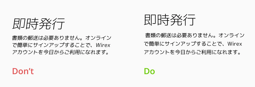
Typography in Japan is not merely about selecting fonts; it's about strategically arranging them to enhance readability and user engagement. Web design expert Hayataki Masaharu highlights essential best practices, recommending larger font sizes, precise letter spacing, and generous line heights specifically tailored to Japanese scripts. The absence of spaces between words in Japanese text contributes to a consistent and continuous visual flow, which, while visually pleasing, introduces complexity in alignment and layout adjustments, famously dubbed "line break hell."
Practical Typography Best Practices
To address these challenges, designers need careful alignment and layout strategies, particularly when adapting content for different platforms—whether desktop, mobile, or print. In Japan, justified text alignment is commonly used to maintain visual balance. Tools like CSS properties (text-justify, padding, margins, and responsive font sizing) can simplify managing these intricacies.

Understanding Japanese Font Styles: Mincho vs. Gothic
Historical and Cultural Context
Western typography distinguishes fonts primarily as Serif and Sans-Serif. In Japan, however, the distinction between Serif and Sans-Serif fonts carries deeper historical significance, identified as “Mincho” and “Gothic,” respectively. Mincho fonts, reminiscent of historical brush strokes and calligraphy, convey tradition and elegance, making them suitable for formal or culturally significant contexts. Gothic fonts emerged prominently post-WWII, reflecting a modern aesthetic emphasizing readability, simplicity, and uniformity in digital media.
Beyond Mincho and Gothic
The spectrum of Japanese typography extends beyond Mincho and Gothic styles. Additional styles, such as Sosho (cursive) and Kaisho (structured and formal), find specialized usage in calligraphy and artistic expressions. Font choice in Japanese web design, therefore, is a strategic decision influenced by cultural resonance, the target audience's age, and content purpose, akin to orchestrating a symphony of visual harmony. Japanese users traditionally appreciate structured and reliable information, placing significant trust in authenticity and presentation quality. This cultural preference underscores the critical role of typography in creating effective digital experiences that resonate with local users.
The Intricacies and Solutions in Web Typography
Common Challenges and Practical Solutions
Typography in Japanese localization presents unique challenges distinct from English, such as complex kanji alignment and "line break hell." Practical solutions involve straightforward CSS adjustments for improved readability and consistent alignment. Tools like Google Fonts also aid in optimizing typography for digital platforms.
User Experience and Typography
Typography directly impacts user experience (UX) in Japan. Websites like Yahoo!Japan demonstrate how strategic typography choices, clear font sizing, ample spacing, and line-height adjustments, significantly improve user interaction and content readability.
Cultural Nuances in Web Localization
Successful web localization for Japan necessitates deep cultural understanding. Insights from sources like the Disrupting Japan podcast highlight how societal norms, organizational decision-making patterns, and the esteemed role of designers shape digital interactions. Crafting a culturally attuned digital experience requires embedding these insights deeply into design decisions.
Emerging Typography Trends Designers Should Watch
Responsive and Adaptive Typography
Responsive typography is becoming increasingly critical, adapting seamlessly across multiple devices and screen sizes. Japanese web designers are embracing adaptive typefaces that dynamically adjust font weight, spacing, and width based on user interactions and device specifications. Variable fonts, which offer infinite flexibility in design adjustments, allow for more personalized and interactive user experiences. Furthermore, the increasing emphasis on accessibility ensures that typography choices consider readability across various user demographics, including older users and individuals with visual impairments. Technologies such as AI-driven layout adjustments and automated readability analysis tools are also gaining traction, enabling designers to optimize typography quickly and effectively. These advancements reflect broader global digital trends, positioning Japanese typography at the forefront of innovative web design.
Final thoughts...
Effective Japanese web design blends historical richness with contemporary digital practices through thoughtful typography. Designers must navigate complex kanji structures, select culturally appropriate fonts, and balance aesthetic appeal with practical clarity. Mastering these elements ensures a powerful and resonant digital presence in the Japanese market.
FAQ Section
What is the role of typography in Japanese web design?
Typography in Japanese web design is a central element that influences both aesthetics and user experience. It goes beyond font selection, incorporating strategic layout, cultural context, and character structure to ensure clarity, engagement, and accessibility for Japanese audiences.
What is the difference between Mincho and Gothic fonts in Japanese typography?
Mincho is the Japanese equivalent of serif fonts, inspired by traditional brush strokes and used for formal or traditional contexts. Gothic corresponds to sans-serif styles, offering clean, modern readability ideal for digital content and general-use websites.
What are the common challenges in Japanese web typography?
Japanese typography faces challenges such as managing dense character scripts, complex kanji alignment, and issues like "line break hell" due to the lack of word spacing. Designers must use responsive layouts, larger font sizes, and precise spacing to maintain clarity across devices.
What are best practices for implementing Japanese typography in web design?
Best practices include using larger font sizes, appropriate letter spacing, and generous line heights tailored to Japanese scripts. Justified text alignment and responsive font sizing using CSS help ensure visual balance and legibility across different screen sizes.
What is responsive typography and how is it used in Japanese web design?
Responsive typography adjusts text presentation across different devices to maintain readability and design consistency. In Japan, designers use adaptive typefaces and variable fonts to optimise UX, improve accessibility, and deliver culturally resonant digital experiences on all screen sizes.
Ready to learn how to launch, integrate and scale your business in Japan?
Download our intro deck and contact ULPA today to understand how we will help your company learn the rules of business in Japan, and then redefine those rules.
Let The Adventure Begin.
Contact ULPA for Help Launching
Your Company in Japan


Comments